
Hi All,
In this blog post I will guide you through how to create a Sankey Diagram. Sankey diagrams are a specific type of flow diagram, in which the width of the arrows is shown proportionally to the flow quantity. They are a great way to visualize inflow .
The following is how a Sankey Diagram looks like

This chart has three component :
A: Stacked bar chart for Segment ( Consumer , Corporate and Home Office ) in the left
B: Flow Diagram in the centre . The widht of the line is propotinal to sales .
C: Stacked bar chart for region in the right.
This chart basically depicts how sales in different Segments is distributed across different regions.
Now as we know what is a Sankey Diagram and what it represents lets start building it step by step.
Step 1: The first step to build the Sankey Chart is to duplicate the entire data. This can either be done using the Legacy Connecter in Tableau or manually in the source excel file . We need to add a extra column for identifying the data . This will have two values : Primary and Duplicate.
Step 2: Get the data into Tableau .
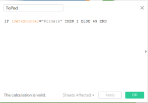
Step 3: Create a calculated feild ToPad . This step is required for Data Densification.
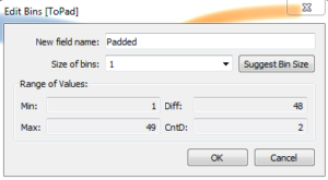
Step 4: Create a bin for the above created feild ToPad. Make sure the bin size is 1.
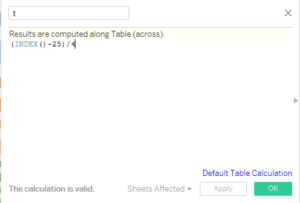
Step 4: Create a calculated field t.
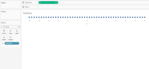
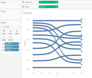
Step 5: Bring the calculated field t to the columns shelf , bring padded to the Detail mark and compute t using padded. Change the marks type to circles. Your Screen should look something like this.
Step 6 : Create a calculated feild Rank 1 .
![]()
Step 7 : Duplicate the Rank 1 feild and rename it to Rank 2
![]()
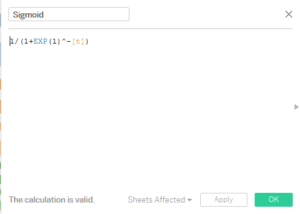
Step 7: Create a calculated feild Sigmoid
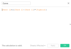
Step 8: Create a calculated feild for Drawing the curve.
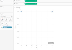
Step 9: Bring the newly created Curve to the rows .Add Segment and Region to Detail along with Padded. You will notice just two dots on your screen . Your screen should look something like this.
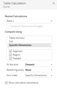
Step 10 : To allow the Curve to be calculated correctly we will have to use the nestedtable calculation . To get to the window of nested table calculation go to the dropdwon in curve and then select edit table calculation.
Calculate Rank 1, Rank 2 and t as shown in the screen shots.
![]()
Once done your screen should look something like this:
Step 11: Edit the axis ranges , for t keep the range from -5 to 5 and for Curve keep the range from 0 to 1. Also for teh Curve axis , reverse the axis. Hide both the axes.
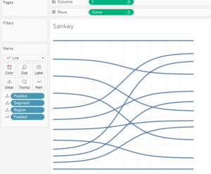
Step 12: Change the marks type to line and in the Path bring the padded variable. You should now be able to get the lines of the Sankey. Below is the screen shot .
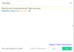
Step 13: To size the curve with respect to the sales we now create another Calculated feild For Size:
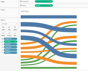
Step 14: Bring this calculated feild in the Size marks, compute using padded and add Segment to the colour mark.
With this you will be able to get the most important component of Sankey Chart . This is what your screen should look like now.
90% of our job is now done. Now we need to create two different stacked bar charts in two different sheet : One for Segment and the other for region. Once done we can align our three sheets in the dashboard to get the Desired Sankey Output.
You can find the tableau workbook here : Sankey Chart
Do let me know if you are not able to follow the steps.
Comments are appreciated.
Thanks
Rahul Singh
Hello Andre, Can you share the workbook with me so that I can take a look into it ?