In this article we will see how to construct a rank/bump chart in Tableau. A rank chart is an effective way to see how the rank of our dimensions varied across year.
Lets suppose we rank each of the sub category in our Super store data and would like to see if the ranking of these sub categories by sales changed over time or remained constant. A rank chart comes to our rescue for this.
Lets go ahead and create a Rank chart that helps us to show how the rank of the Sub Categories has changed across year.
Step 1: Drag Year Date to the Columns .
Step 2: Drag the measure Sales to Rows and place Sub Category in the Details mark.
Step 3: Drag the measure Sales again to the rows in front of the previous Sales measure.
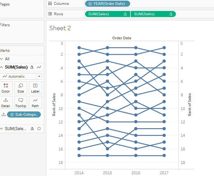
Your worksheet should not look some what like this :

Step 4: Right click on both the Sales measure and add a quick table calculation Rank to both of them. Compute these by Sub Category .
Step 5: Click on the second sales measure and click change the mark type to Circles, resize the circles.
Step 6: Right click on the axis and select synchonize axis. Once the axis is synchronized go to edit axis and check the Reversed Option under Scale.
After some formatting your rank charts should be ready.
Here’s the Tableau Workbook for your reference :
Thanks
Rahul Singh
Hi Brad, One way is to adjust the labels manually. The other thing that you can try is placing the labels on the circle mark , select marks to label as Most Recent and in the scope select pane. Choose the alignment to be middle right.
Hope this helps you.