
In this series of blog we will try to understand the options available under the Analytics Pane in tableau ( Constant Line, Average Line , Reference Line & Bands and other features.
We will start our discussion with the first option available , the Constant Line.
The constant line add a line/band (depending upon the specifications set ) to the view in the worksheet.
To understand this lets discuss it with a example. From the Samplestore data Drag order date to the Columns and Sales to the Rows. Right click on Orderdate and select the month that appears second ( the continuous month ). We have now the monthly sales report.

To add constant line to this view go the analytics pane ( just aside the data pane in the left of the screen) and drag the Constant line to the worksheet . Here is what your screen will look like when you do this:

We see that a popup comes which asks us the axis on which we want to place the constant line . To add a constant line to a specific axis , drag the constant line option to the particular axis. In out case lets drop it to Month(Order Date).
As soon as you place it on the Month Axis a pop up comes that asks us to enter a date value .
Select a date and you will see the constant line appear on the month axis.
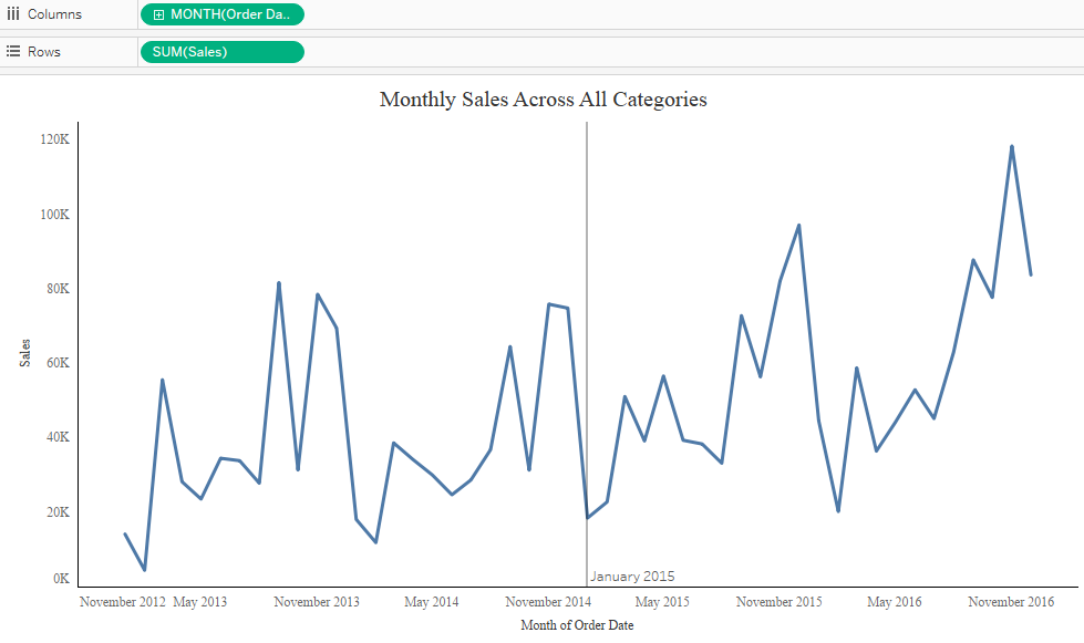
The value shows the Date where the constant line is applied ( 1 Jan 2015 in our case ) . Multiple constant lines can be applied to a axis.
There is much more we can do with out Constant line we have just added . To explore these options right click on the constant lien and you will see the following : Edit , Format And Remove.
When we click on the edit options the following pop up box appears.

In this pop up window we can change the constant line value . Under the formatting option we can change the format of the line and fill the area above and below with specific color.
Following screenshot shows the above.

In the above case we can also make this constant line dynamic using a parameter. The worksheet below show the same . Here you can change the Value of Sales and accordingly the color of the bars and area will change ( green if the sales is above the chosen value and red if below the chose value.
You can give this a try and see if you are able to achieve it . In case not you can always ping me back.
In the next article we will discuss about Average Lines.
Thanks
Rahul Singh