
Today in this article under Analytics pane we will discuss about Cluster Analysis. Clustering is a powerful new feature in Tableau 10 that allows you to easily group similar dimension members. This type of clustering helps us create statistically-based segments which provide insight into how different groups are similar as well as how they are performing compared to each other.
Lets try to see how the clustering feature works using the sample super store data.
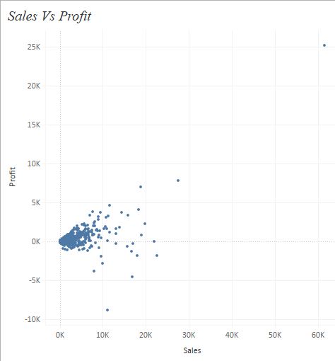
To demonstrate cluster analysis lets start by building a scatter plot. Bring Sales to the Columns shelf and Profit to the rows shelf. Drag product name to the details shelf. Your screen will now look like this:
Once we have the scatter plot ready lets go to the analytic pane and drag Cluster under models to our worksheet. As soon as we drop this onto the worksheet we can see a pop-up screen as under :
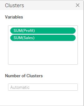
This pop-up box allows us to select the variables on which we want to create the clusters and define the number of clusters that we want in our dataset. By default we can see only Profit and Sales variable in the box, we can add more variable by dragging it into the Variables space in the pop up window. The number of clusters can be specified into the Number of Clusters space. Lets enter 3 in that space and close the pop-up window. Our screen will now look as under :

Here we can see that our scatter plot in now divided into three clusters- each represented by a different color.
There’s much more we can do with the clusters that we created. To edit the clusters right click on the Clusters in the colors mark and select Edit . Describe clusters provides us with a summary statistics related to cluster analysis.
Following is the result when we select Describe Cluster from the dropdown.

What next?
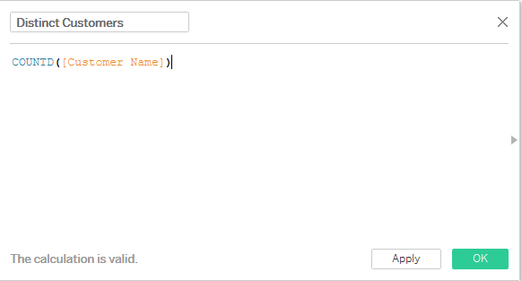
Lets say we want to see how many customers are in each cluster and what is the average sales, profit and discount for each of these clusters.
To do this drag the Cluster variable form the color mark to the Dimensions area on the left , you will notice that a dimension for cluster gets created. Rename it as Cluster 3 ( to signify that it has three clusters ) .
Create a calculated field to count the number of distinct customers:
Drag the cluster dimension Cluster 3 to Rows. Bring Measure names to the filter marks and select the measures Discount, Profit, Sales and Distinct Customers. Drag measure names to the Columns and place measure values on the text mark. Select the default aggregation of the measures (Profit, Sales and Discount ) as average.
We will have the following table on our worksheet now:

In the table above we can easily see how the profit , sales and discount varies for each of the cluster created along with the number of customers that are under each clusters.
Hope you guys enjoyed the post . Do let me know in case of any doubts .