Hello Everyone out there.
This is the first in series of my blog post “Visualising data in Tableau from Scratch”.
In the subsequent blog following this one I will discuss about the different chart types and when to use a certain chart type. The underlying data for all these would be the Sample Superstore data that is provided by Tableau. We will start with the default chart types and then slowly move to Advance Charting in tableau.
So let’s roll our sleeves and get going.
A bar chart is the most simple yet most powerful way of data repsenation. It is a pictorial representation of data (generally grouped), in the form of bars, where the length of bars are proportional to the measure of data . They can immediately see comparative relationships as well as approximate numeric values.Bar charts are most effective while comparing data across categories.
Bar Charts can be broadly divided into four major types :
- Horizontal/Vertical Bar Charts
- Grouped Bar Charts
- Stacked Bar Charts
- Segment Bar Chart
Lets look into each of these and see how we go around creating these in Tableau.
Horizontal/Vertical Bar Charts: To create a horizontal/vertical bar chart in tableau we need one or more measure and zero or more dimension.
To know more about measure and dimension check out my blog here .
For example in the superstore data we would like to see how our sales is distributed by Region , we would bring the Region dimensin into columns and the sales in Rows. Adding region to the colours mark and sorting the sales gives us the following :

At the very first look we see that the sales is maximum for West region and the least for Sout Region.
Grouped Bar Charts : These bar charts can be thought of a stacked bar chart , the only thing being we have unstacked them and put the bars side by side horizontally. Grouped bar charts are used when we are trying to see a measure across two dimesions, let’s say we want to see how our sales of product segment are performing within region. To do this we bring Region and then Segment in Colums. We then bring our measure value sales in Rows and add Segment to the colour.

Stacked Bar Chart : The stacked bar chart is great for adding another level of detail inside of a horizontal bar chart. In Tableau this is created by adding other dimension to colour marksin the original bar chart we created at the starting of the post. To do this we bring Sales into Rows pill , Region into Colums pill and add our Segment dimension into Colours mark. Following is how a stacked bar chart looks in tableau :

A stacked bar chart is very easy to visualise. We can easily see how the sales of Segments are across the different region.
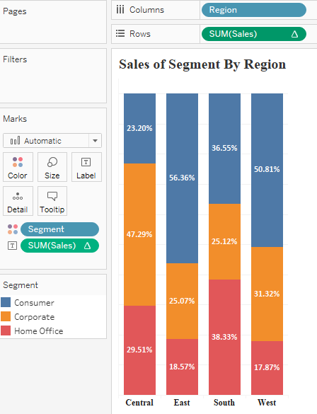
Stacked Bar Chart in Percentage : This is a extension of a stacked bar chart in which each individual bar is split by Percentage of the dimension ( the value of the percentages sum up to 100 ). The base for creating this is a stacked bar chart. Once a stacked bar chart is created , we add a quick table calculation ( percentage of total ) to our measure . This is done by clicking on the Mesures (Sales in our case) , selecting Quick table calculation and then percentage of total. The measure is then computed across Segment. Hold ctrl and drag this measure to the label to show the percentage values. This is how the chart looks like:

Here we can easily see that teh Corporate segement accounted for 47.3% of total sales in the central region.
Hope this article helps you. Comments are appreciated . Follow this space to see more exiting stuff coming forward.
Thanks
Rahul Singh
