
Hi every one. In the earlier blog we discussed about how to represent a time series data on a radial chart. This post is also about circles , but with a twist. Today we would be discussing about how to create Circles with a common base , but different radius. These can be thought as an alternative to the conventional bar charts that we use. Before we start let me thank Toan Hoang for his brilliant blog where I found this information.
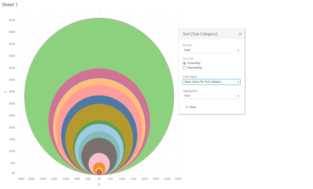
Here is what a circle with common base looks like .
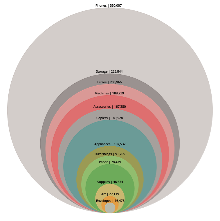
Here you can see the sales across various subcategories is now shown by circles of different colors with a common base which are easily differentiating as the radius of the circles are proportional to the sales of the respective subcategory.
We will use the sample super store data to build this chart , and going forward you all can follow the steps and use it on your respective datasets.
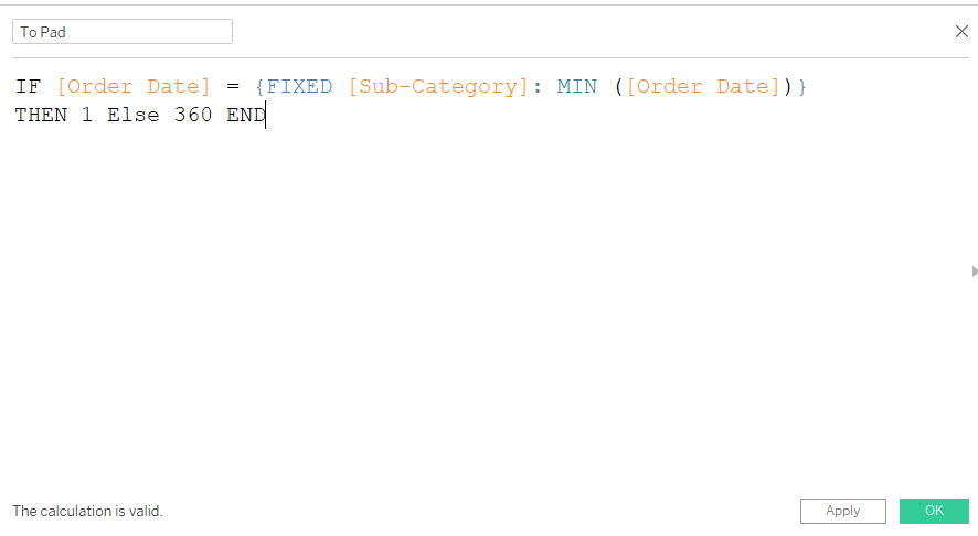
Step 1: The first step is to duplicate the data so that we have two rows for the dimension with different path values. As the sample superstore data already has more than one row for the subcategories sales corresponding to different dates , we will use a calculated field to achieve this which would save us from increasing the data size to double.
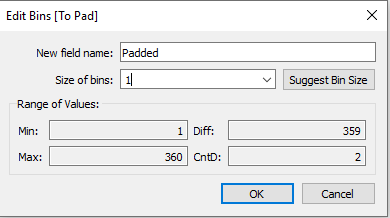
Step 2: Right click on the calculated field that we just created ( to pad ) and select create bins. Make sure the bin size is 1.
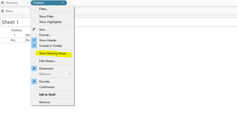
Bring the padded field on the Columns >> Right click and then unselect the show missing values option.
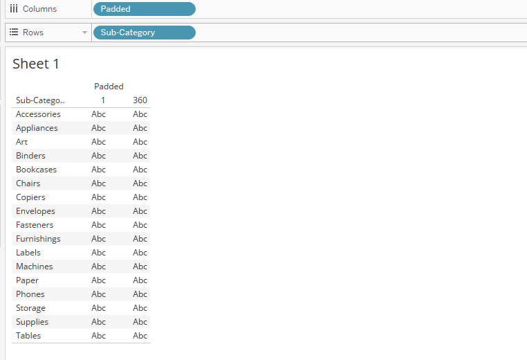
Now bring the Subcategories to Rows. You can see that we have created two rows for each subcategories with the values 1 and 360 as under.
Remove the subcategory from the rows, select the option “show missing value” in padded and then bring the field padded from the columns to the Detail mark and from the marks type select polygon.
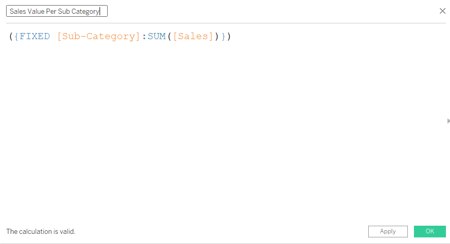
Step 3 : Create a calculated field to calculate the total sales across the sub categories as under.
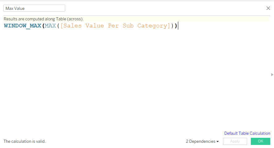
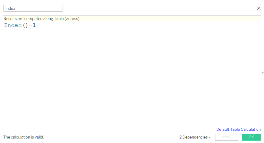
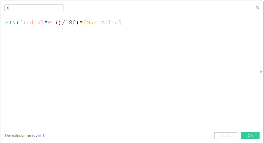
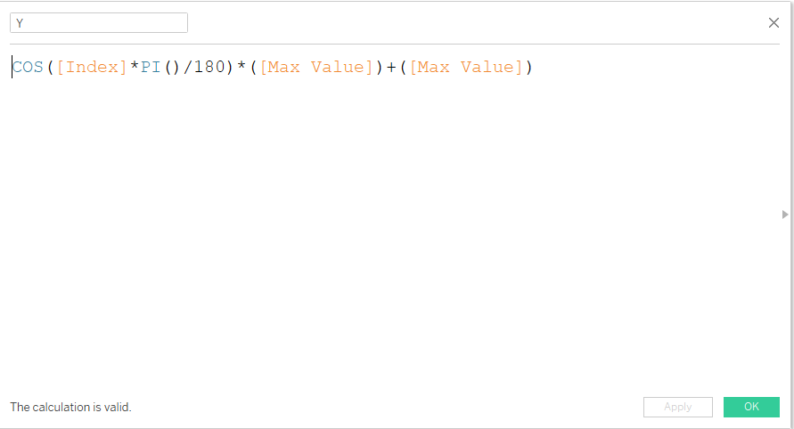
Step 4: Create the following calculated field max value, index, X and Y as under .
Step 5 : With all our calculated fields in place lets bring them into respective place so that we have our desired chart in place. Bring X to Columns , Y to Rows and calculated both of them against padded. This is what your screen should be looking like now:
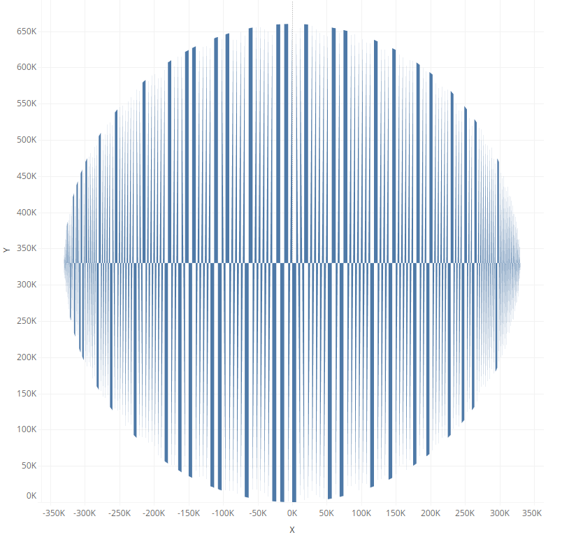
If this is what you are looking at your screen you are on the right path.
Step 6: Drag padded to the path, bring subcategories to the color and sore the subcategories by “Sales Value Per Sub Category” and there you go, you have your charts ready.
You can now go ahead and format the chart, remove grid lines.
To add the labels add a secondary X axis and select the mark as lines and then add labels.
What Next
Try editing the cordinate values and make these a concentric circle as under:

Mail me ( rahul@vizzingdata.com ) or connect with me and let me know how you use this chart or in case if you are not able to follow the steps to create the chart.
Hope you guys enjoyed this!!