
In this blog we will learn how to create Small Multiples chats also called as Trellis charts in Tableau. Let us first understand what a small multiple chart is .
For this tutorial we will use the Global Super Store data. Let us suppose you need to show the trend of sales across different regions. that are available in the dataset .
The most common way for us to do that would be dragging sales on rows, order date on columns and then region on to the details or color marks to have a chart like this
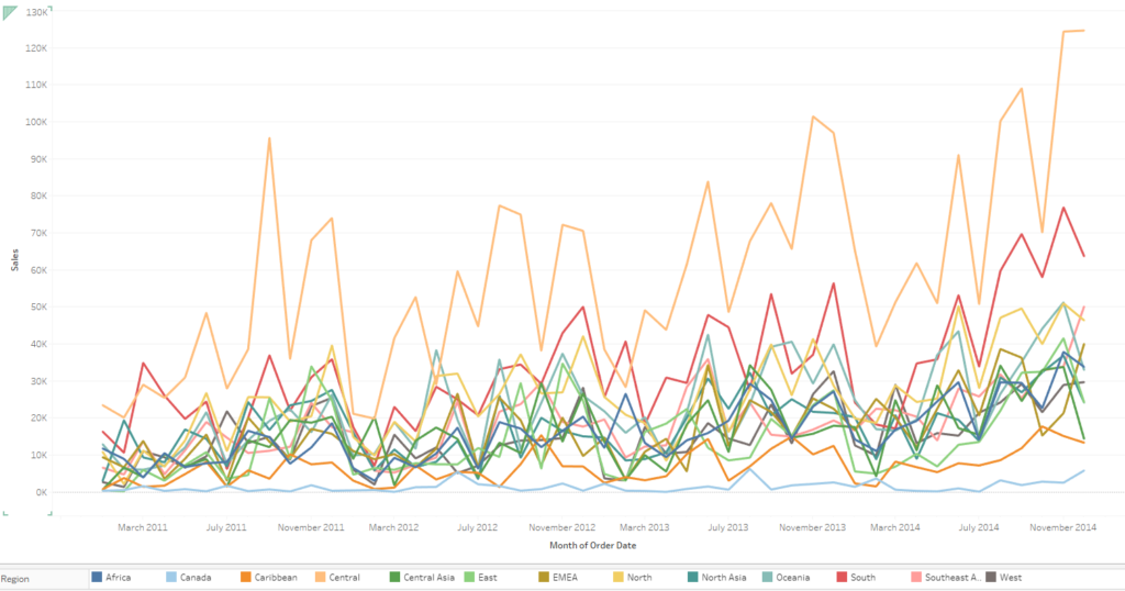
The chat achieves what we wanted however there are a couple of thing that is hard to figure out in the chart. First of all the chart looks too busy and its hard to differentiate the trend of sales across individual regions. Secondly we are not able to have the information about when was the sales maximum/minimum for the regions across the time frame.
To overcome this we can use a trellis/small multiple chart that would divide our workbook into grids for individual region depicted above.
Lets built this step by step.
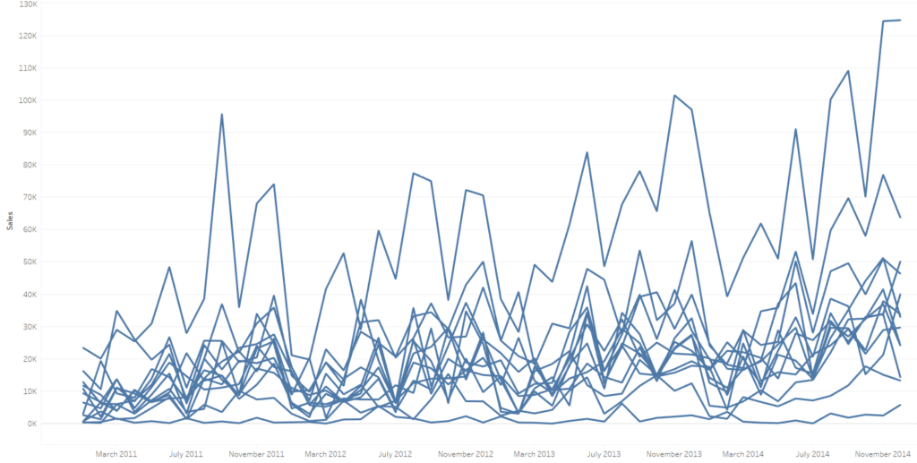
Step 1: Create the above visual by dragging order date in columns ( right click and select month order date and change it to discrete ) and sales on the row shelf. Bring Region on the details mark. Your workbook should now look as under:
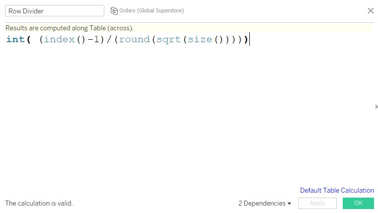
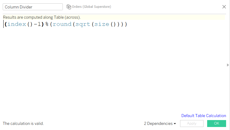
Step 2: Create the following two calculated fields Row Divider and Column Divider.
Step 3: Convert both of these calculated field to discrete. Drag row divider to rows and column divider to columns. Right click on these and compute them using Region and there you go. You can see your workbook divided in grids with each grid occupying one region as under.
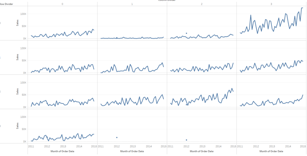
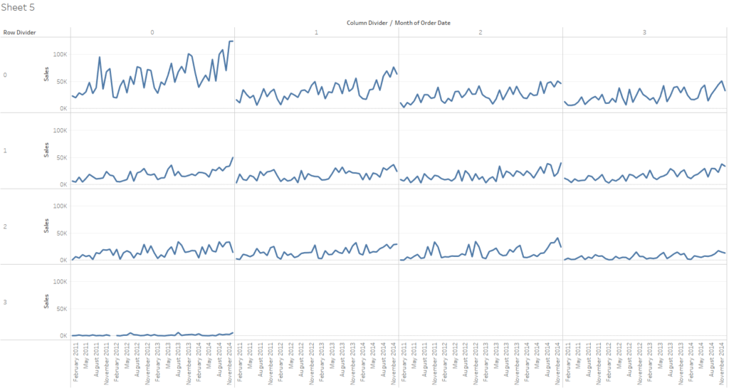
If you wish to sort these region by sales you can do that as well by right clicking on region and sorting it descending by sum of sales to have a view as under:
Step 4: The next challenge that comes up is adding labels to these grid so that we can differentiate which grid belongs to which region. To do that create a calculated field as under :
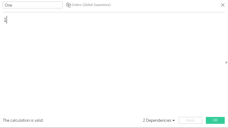
Step 6: Drag this field on the rows after the sales field and change the default aggregation of it to avg. Right click on it and select dual axis. You view should now be as under:
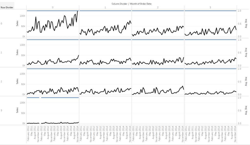
In the marks card for the measure one , drag the region from the detail to text and change the opacity of the blue line to zero to make it invisible. Format the workbook and align the labels to have a beautiful trellis/small multiple chart as under.
Hope you guys enjoyed this post and let me know in case you are not able to follow any of the steps to recreate the chart.
Happy Learning!