
Hi All,
In this blog I will be writing about how to build pareto charts in Tableau. A Pareto chart, also called a Pareto distribution diagram, is a vertical bar graph in which values are plotted in decreasing order of relative frequency from left to right. Pareto charts are extremely useful for analyzing what problems need attention first because the taller bars on the chart, which represent frequency, clearly illustrate which variables have the greatest cumulative effect on a given system.
Here is what a pareto chart looks like:
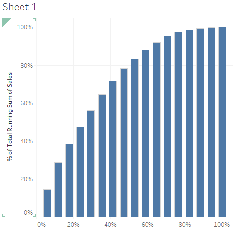
This chart tells us that about 40% of our subcategories are responsible for around 70% of the total sales.
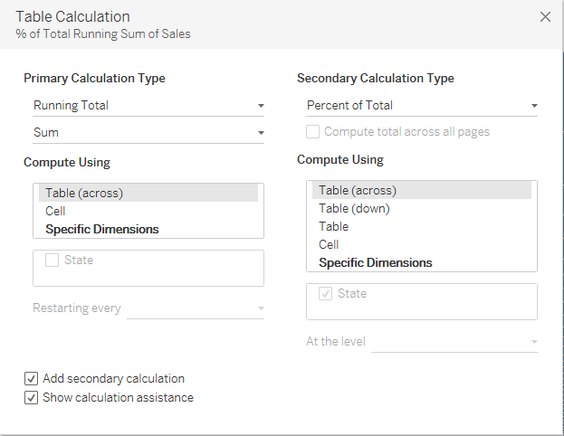
Let us try to find out what percent of states are responsible for 80% of the sales.
We will be using the sample superstoredata for our Pareto chart.
Step1: Bring States to columns.
Step2: Bring sales to rows and sort the states in decending order of sales.

Step 3: Remove the states from the columns and place it on the level of detail mark.
Step 4: Click on sales and add a quick table calculation Running Total.
Step 5: Go to edit table calculation and add a secondry calculation Percentage Of Total.
Step 6: Add a calculated feild index()/size() in the column and compute using State.
Step 7: Compute sales in rows using State.
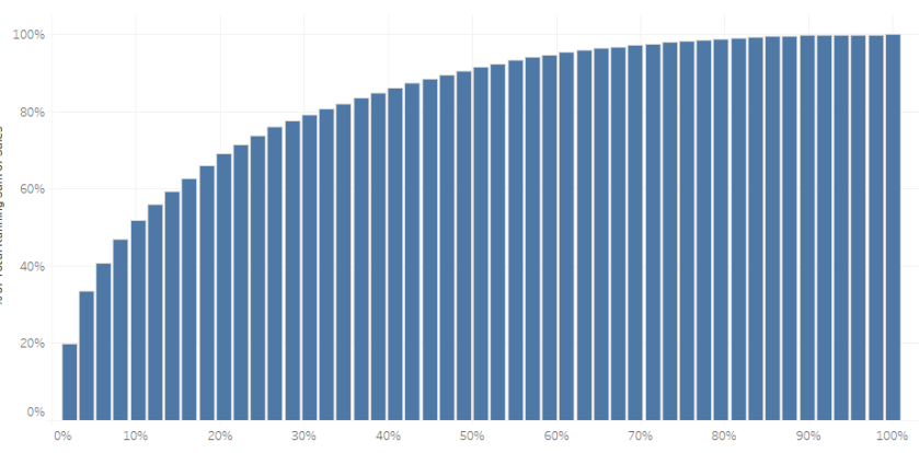
Step 8: Change the mark from Automatic to bars and your Pareto Chart is ready.
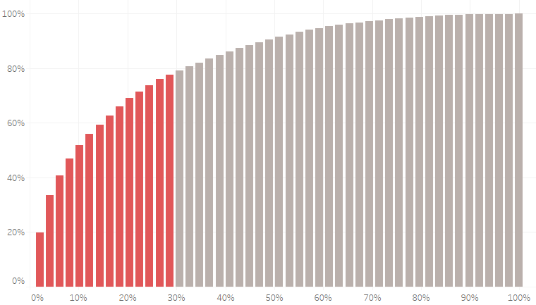
We can see from the chart that around 30% of the states consitiute about 80% of the total sales.
You can format the chart as well to give it a better look:
Please let me know if you are not able to follow the steps.
Thanks.
Rahul Singh